> For the complete documentation index, see [llms.txt](https://docs.intelligems.io/llms.txt). Markdown versions of documentation pages are available by appending `.md` to page URLs; this page is available as [Markdown](https://docs.intelligems.io/merchandising-experiences/offers-integrating-widgets/progress-bars.md).
# Progress Bar
Add a fully customizable Progress Bar component to an Offer Personalization or Test, or a Shipping Test.
## Overview
Progress bars visually show customers their progress toward rewards like discounts or free shipping in an Offer Personalization or Offer Test. They can also be used in a Shipping Test. They motivate customers by showing "how close am I to unlocking this discount?" and help drive larger cart values.
{% hint style="warning" icon="traffic-light-go" %}
**Before you start:**
* Progress Bars require a minimum purchase requirement (dollar amount or quantity) to function.
* This must be manually set for Amount off products, Amount off order, and Free gift offers.
* On Quantity discount, Threshold discount and Free shipping Offers, Progress bars are automatically available to use.
{% endhint %}
## Configuration
### **Basic Setup**
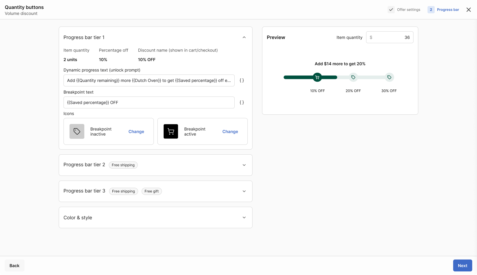
* **Dynamic progress text (unlock prompt):** The sentence that will be rendered when there are discount tiers to unlock. It will render the next tier that the customer is eligible for. Ex. "Buy 2 additional packs to get 10% off" or "Spend $10 more to get free shipping".
* **Dynamic progress text (reward text):** The sentence that will render in place of the "Unlock Prompt" message when a user has unlocked all tiers. This will also render below the progress bar along with the "Unlock Prompt" message for each individual tier accomplishment. Ex. "Congrats! You've got 10% off!" or "You have unlocked free shipping!".
* **Breakpoint text:** The sentences that will show on hover of each tier breakpoint in the progress bar. Ex. "Buy 3 to get 10% off" or "Spend $50 to get free shipping."
* **Icons:** The icons shown at the breakpoint before and after it has been achieved.
### **Dynamic Variables**
Use dynamic variables to populate progress bar text automatically — like the amount remaining or discount amount. Type two brackets or use the field menu on the right to insert them.
**Example Usage:** "Spend {Amount remaining} more to unlock {Discount amount} off!"
#### Discount Variables
* `{Amount remaining}`: Show remaining amount needed
* `{Discount amount}`: Display discount value
### **Color & Style**
Styling options available include:
* **Bar style:** Choose from three bar style options.
* **Checkpoint classic:** Best for multi-tier setups.
* **Floating milestones:** Compact layouts with 2-3 tiers.
* **Minimal:** For single-tier setups like free shipping.
* **Bar & Breakpoint appearance:** Control the thickness, corner radius and size of bar elements.
* **Colors:** Control the colors for all fields.
* **Typography:** Control the font sizes and styles for each text field.
{% hint style="success" %}
You can also customize the look of your progress bars in [**Global Styles**](/general-features/editors/global-styles.md) (left menu) to keep them consistent across all your offers. You can adjust bar styles, bar colors, text options, and set separate styles for desktop and mobile.
{% endhint %}
## Integrating the Progress Bar
Paste the following code snippet into your Shopify theme code, in the theme file that renders your cart in order to add a Progress Bar to a Test or Personalization. This file may be called something like `cart.liquid`, `slideout-cart.liquid`, etc. We recommend adding this code snippet at the top of the section that relates to your cart:
```html
```
Not sure where to add the above snippet? Use our Claude prompt here!
Instead of guessing which file to edit in your Shopify theme, you can give Claude AI access to your live store. Claude then inspects the actual cart HTML structure in real time, identifies your theme and version, and tells you the exact file and location to paste the Intelligems snippet.
This works for any Shopify theme — Horizon, Dawn, Debut, Prestige, Impulse, Empire, custom themes, etc.
**Prerequisites**
1. A [Claude.ai](http://claude.ai) account (Pro plan recommended — needed for browser extension access)
2. The Claude browser extension installed in Chrome
3. Access to your Shopify store (you need to be able to open the storefront in a browser tab)
**Step-by-Step: How to Use Claude to Find Your Snippet Location**
1. Open the **Claude extension** in your Chrome browser by clicking the Claude icon in your browser toolbar.
2. Copy the prompt in 2b (including i-v) below and paste it into Claude.
1. Use the prompt below verbatim. Do not modify it. It is engineered to give Claude all the context it needs to inspect your store and return a precise, actionable answer.
2. **Prompt:** You are a senior Shopify developer and Intelligems integration specialist. I have my Shopify storefront open in this browser tab. Please do the following:
1. Inspect the current page using developer tools. Run JavaScript to detect: the Shopify theme name and version (from window\.Shopify.theme), the cart drawer structure (look for cart-drawer-component, cart-drawer, or equivalent custom elements), and the full parent-child DOM hierarchy of the cart — specifically the container that holds the cart header/title at the top, the scrollable items list in the middle, and the totals/checkout area at the bottom.
2. Based on what you find, identify the exact Shopify Liquid file that renders the cart (e.g. sections/header.liquid, sections/cart-drawer.liquid, snippets/cart.liquid, etc.).
3. Tell me exactly where inside that file I should paste this snippet: \\
4. CRITICAL placement requirement: The snippet must appear at the TOP of the cart drawer — directly below the cart title/header and ABOVE the list of cart items. Do NOT place it near the totals, subtotal, or checkout button area at the bottom. The goal is for the progress bar to be the first thing a shopper sees when the cart opens.
5. Be specific: name the file, describe what CSS class or HTML element to search for in that file, and whether to paste the snippet before or after it. Also explain why that location is optimal. If you see anything that might cause issues (e.g. existing progress bars, conflicting elements), flag it.
3. Hit Enter and wait. Claude will inspect your live store DOM, detect your theme name and version, identify the cart structure, and output the exact file name and placement.
4. Go to Shopify Admin → Online Store → Themes → ··· → Edit code. Open the file Claude named, find the exact line it mentioned, and paste the snippet there.
5. Save the file and reload your store. While previewing a test or personalization that has a progress bar, add a product to the cart and verify the progress bar appears in the cart drawer.
If you already have a progress bar in your cart, remember to comment the existing progress bar out to avoid showing two!
{% hint style="warning" icon="triangle-exclamation" %}
**Heads up:** If your theme uses `` or ``, those snippets still work — no changes needed. We've since updated to a single unified snippet to streamline installation.
{% endhint %}
#### Integrating with Rebuy Carts
If you use Rebuy for your slide out cart, you'll need to follow these steps to add the Offer progress bar.
1. Create a Rebuy custom smart cart template. Follow [this](https://help.rebuyengine.com/en/articles/6120362-how-to-use-a-custom-template-with-smart-cart) article for instructions.
2. Edit the template to replace the Rebuy progress bar with the Intelligems progress bar snippet. See above.
---
# Agent Instructions
This documentation is published with GitBook. GitBook is the documentation platform designed so that both humans and AI agents can read, navigate, and reason over technical content effectively. Learn more at gitbook.com.
## Querying This Documentation
If you need additional information that is not directly available in this page, you can query the documentation by asking a question.
Perform an HTTP GET request on the following URL with the `ask` and `goal` query parameters:
```
GET https://docs.intelligems.io/merchandising-experiences/offers-integrating-widgets/progress-bars.md?ask=&goal=
```
`ask` is the immediate question: it should be specific, self-contained, and written in natural language.
`goal` is what the user is ultimately trying to achieve, the reason they need the answer. Sharing it helps GitBook give you a better, more relevant answer. A goal is most helpful when it describes the outcome the user wants rather than restating the question. For example, with `ask=how do I create an API token`, a goal like `automate deployments from our CI pipeline` lets GitBook tailor the answer to that use case.
The response will contain a direct answer to the question and relevant excerpts and sources from the documentation.
Use this mechanism when the answer is not explicitly present in the current page, you need clarification or additional context, or you want to retrieve related documentation sections.